Quest for Achromatic Elegance
Elevating Design with Black, White and Grey

Achromatic elegance
Achromatic elegance – embracing the timeless allure of black, white, and the myriad shades of grey – stands as the epitome of sophistication in the realm of design. Achromatic colours have no saturation or vividness, as they have no dominant hue, either. And while in chromatic colours only one particular wavelength of light dominates, achromatic colours contain all wavelengths of light within them.
Devoid of the vibrancy found in their chromatic counterparts, achromatic colours possess a purity and depth that is unparalleled, making them indispensable tools for designers. For designers subscribing to the Scandinavian Design school, achromatic colours represent a true cornerstone for most design projects. Rooted in the rich heritage of Nordic design, the ethos of Scandinavian design champions a harmonious blend of functionality and minimalist aesthetic, with achromatic palettes lending an air of understated luxury to every project.

Lightness exists within both chromatic and achromatic colors
Lightness is a property that exists within both chromatic and achromatic colors – in varying degrees. This means that both chromatic and achromatic color schemes contain light and dark colors.
Black, white and everything in between – that’s also a very commercial recipe. Achromatic colours are best-sellers in most markets, for obvious reasons – most walls and ceilings are white and will remain so in the foreseeable future.

Elevate form & function
In both architecture and interior design, the judicious use of achromatic colors transcends mere aesthetic appeal, profoundly influencing the spatial experience. From expansive kitchens to pristine hospital wards, the strategic deployment of whites, for instance, creates an illusion of space and cleanliness, elevating both form and function to new heights.
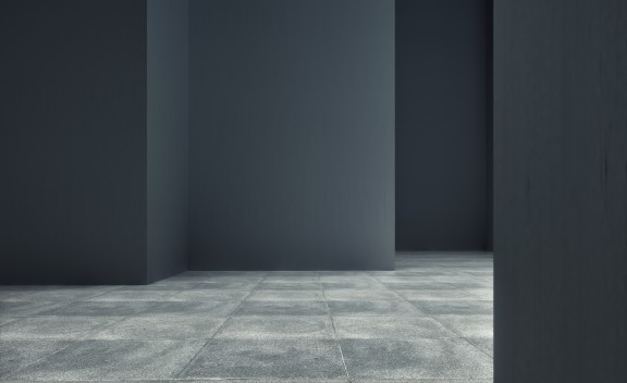
Visually speaking, when you’re dealing with powerful designs in e.g. architecture, use of achromatic colours can serve as a catalyst, accentuating the intended shapes and structures in any given space.
Yet, the allure of achromatic mastery lies not only in its surface appeal, but also in its subtle evolution over time. As design trends ebb and flow, achromatic colors undergo a metamorphosis, transitioning from austere and cool tones to softer, warmer hues, reflecting the zeitgeist of the era.

When grey is pray
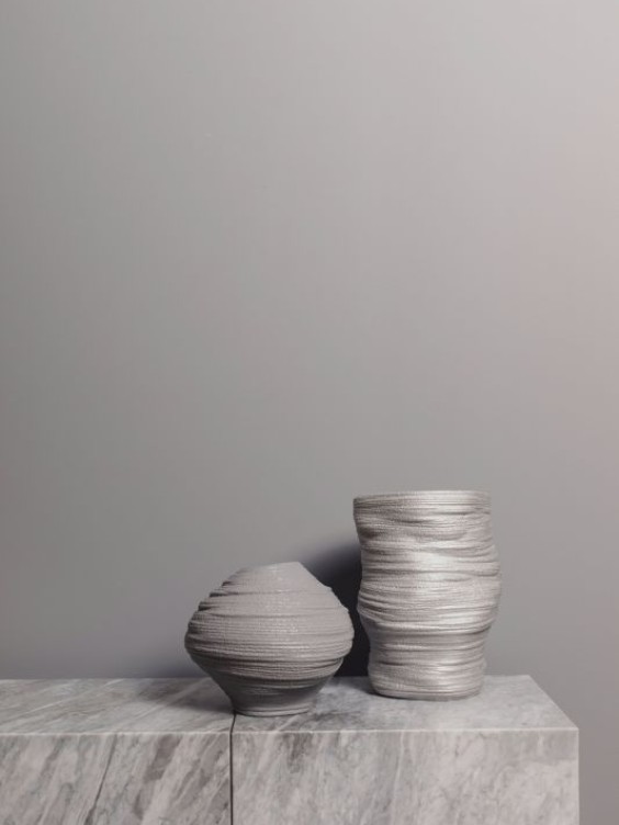
While the pursuit of perfection often leads designers to the realm of neutral grey, it is a journey fraught with challenges. The “perfect grey” is an elusive prey, often veering into unexpected hues, due to such factors as environment, colorants or pigments used in paint as well as lighting which can be hard to control. As a result, the grey will stray, so to speak, showing, for example, a bluish hue.

True grey
Patience and meticulous testing are the hallmarks of achieving true neutrality, ensuring that you actually get the neutral grey you want. And since the true grey is so difficult to lock down, sometimes it makes sense to look into other alternatives (other greys), as well.
Black and white can have sub-hue issues, too; with black colour hinting blue or brown and white showing the slightest yellow. Indeed, the achromatic palette offers great opportunity for exploration, inviting designers to delve deeper into its nuances and complexities. In mastering the achromatic palette, designers embark on a journey of discovery that is marked by endless possibilities.
With every stroke of achromatic brilliance, they pave the way for a futureproof, impeccably balanced design narrative that stands the test of time and taste.


